As an ArcMap user for many years I have long been fascinated by the color choices that come packaged with ESRI products. It’s not that they are bad color combinations it’s just that they are so distinctive. You can pretty well determine at first glance if someone used an ESRI product to make his or her map.
What I am particularly fascinated by is the vivid seasonality evoked by the default color ramps. In particular the bold choices offered by these pastel beauties. While I’m personally a big fan, I can’t say that it’d be my first choice for displaying serious information. You’ll notice that none of our projects feature such a color scheme. But since it’s Easter, I figured I’d go ahead and run with some Easter-Bunny inspired pastel 3D models and maps.
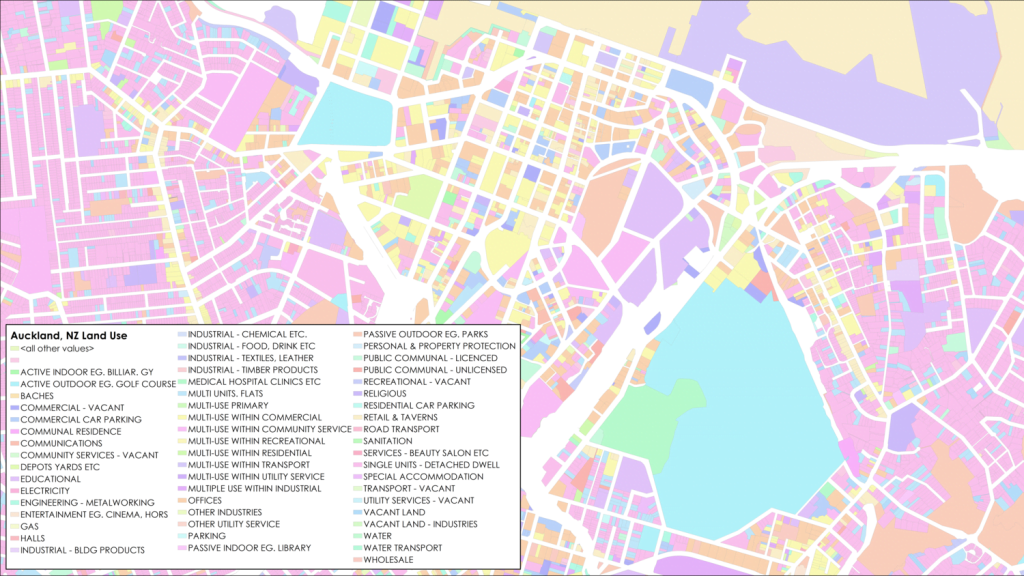
The Easter Bunny color scheme really shines when mapping categorical data. Here we have Land Use in Auckland, NZ. But as you can see it could easily double for a pile of Easter M&M’s.
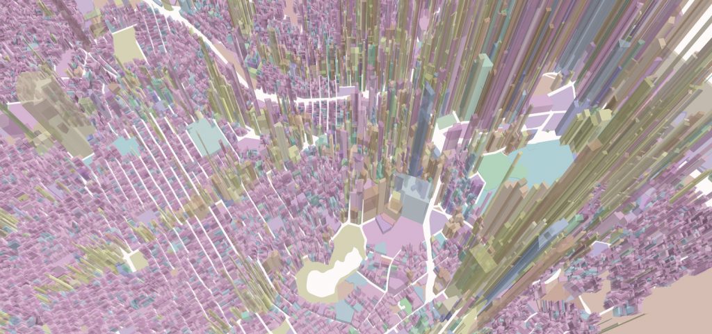
Of course for good measure I had to see what Easter looks like in 3D. Here we have value per hectare as the z value and land use as the symbology. The result might as well be a map of Easter eggs per hectare though.
This actually turned out looking a lot better than I would have expected. That said, I think I’ll stick with our current color schemes. Cynthia Brewer and the ColorBrewer website offers some awesome advice for beautiful map-making.
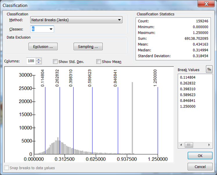
On that note, here’s a long overdue shout out to Jenks. Thanks Jenks, whoever you are, for breaking up our data so naturally.