ot long ago Planetizen released their picks for the top ten websites of the year. I’ll overlook being overlooked since I am humble and because of all the great new resources they introduced me to. I want to give a shout out to three of the websites they highlighted were among my favorites last year too.
Streetmix
Streetmix has the honor of being one of the seven websites I actually have bookmarked. As I recently pointed out American cities are overburdened with pavement.
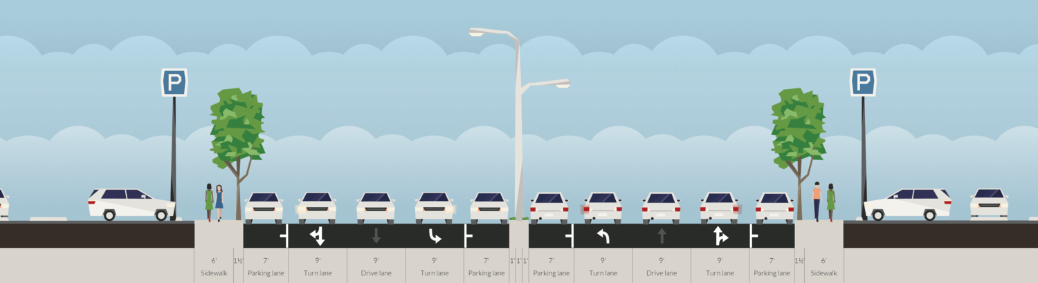

To repair our cities we’ll have to reclaim our streets. Streetmix is a wonderful tool for re-imagining streets or playing around with configurations. Fitting multiple uses into a reasonable space where each functions well is a puzzle that has fascinated me for years. Whether you need to make a point about a dangerous stroad or just want to experiment without a lot of technical investment Streetmix is the way to go.
Strong Towns
I’m glad Planetizen recognized the incredibly important work going on there. Strong Towns is becoming a national focal point for burgeoning agents of smart chaos determined to make their communities better. I have to admit that it has also become my biggest and best source for news about city stuff.
ESRI Story Maps
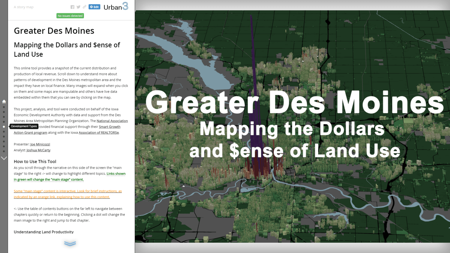
It’s very interesting that Story Maps showed up on this list too since it’s what we used to assemble the upcoming Des Moines project. The quiet brilliance of Story Maps is that, much like Streetmix, it makes some rather technical work very accessible. It also makes perfect sense as a sidecar to their more technical products (ArcMap). If people go through the trouble to make cool maps they should have a cool way to share them. I guess that makes it a sort of Facebook for maps.
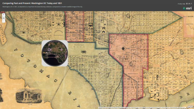
What I forget though it that, in additional to being a tool, Story Maps is also a gallery. You can browse through all the stories users have uploaded. One of my favorites is this “spyglass” that lets you compare Washington DC today to as it was in 1851.
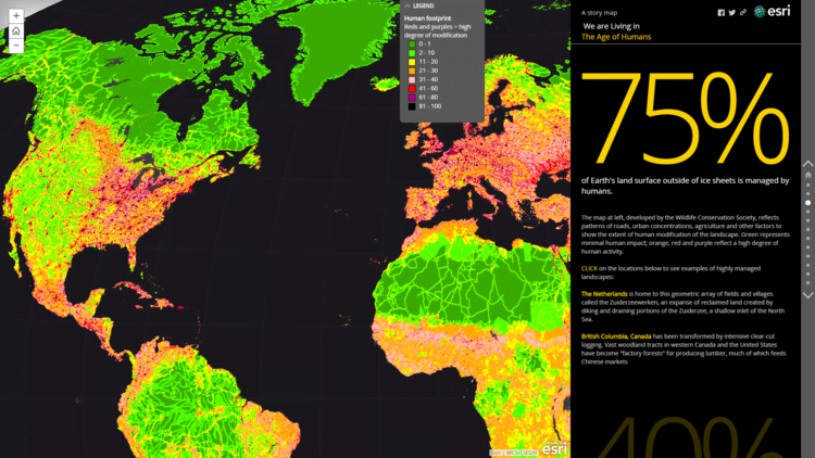
The Age of Humans is an incredible, and somewhat terrifying, view on how the world is influenced by humans. I expect we will experiment a great deal more with Story Maps this year.