At Urban3, two of the first things we always do with a new town, city, or county government client is:
1. Dive into their budget
2. Analyze the property value in the county
First, we take the budget apart and understand where the money comes from, where it goes, and how it compares to macroeconomic trends like population, growth, wages, employment & demographics with similar cities across the US. Then, we use the property values to get a snapshot of the economic condition of the county with current value data. Often these budgets or supplementary documents from the assessor’s office come with historical data as well.
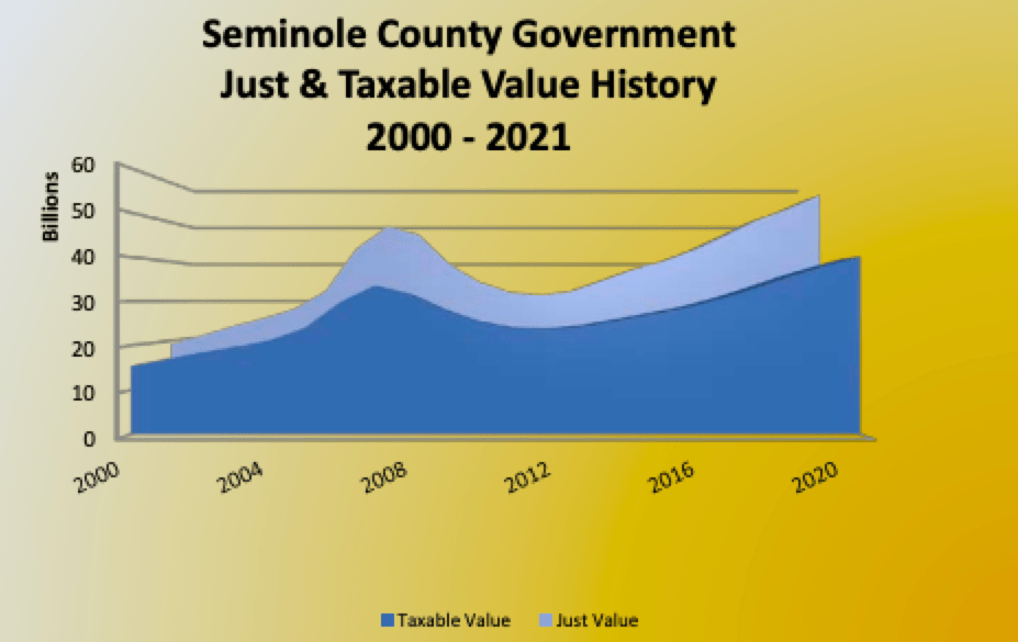
One of the most common historical charts we see is the total taxable value of the jurisdiction. Below is a good example from Seminole County, Florida showing the market value versus the taxable value for the county. The difference mainly comes from the Save Our Homes Act which limits the property tax growth of certain properties. This graph quickly tells the history of the county: notice how you can see the trends of rapid growth in the years before the Great Recession, the steep collapse when it happened, and the gradual recovery. Eventually, these values overtook their pre-recession levels.
These charts are good but could be improved upon. Specifically, they’d be more useful to city leaders and the public if they more accurately showed the trends within local jurisdictions, and if they showed the difference between increases in current taxable value through property appreciation and the value of new construction.
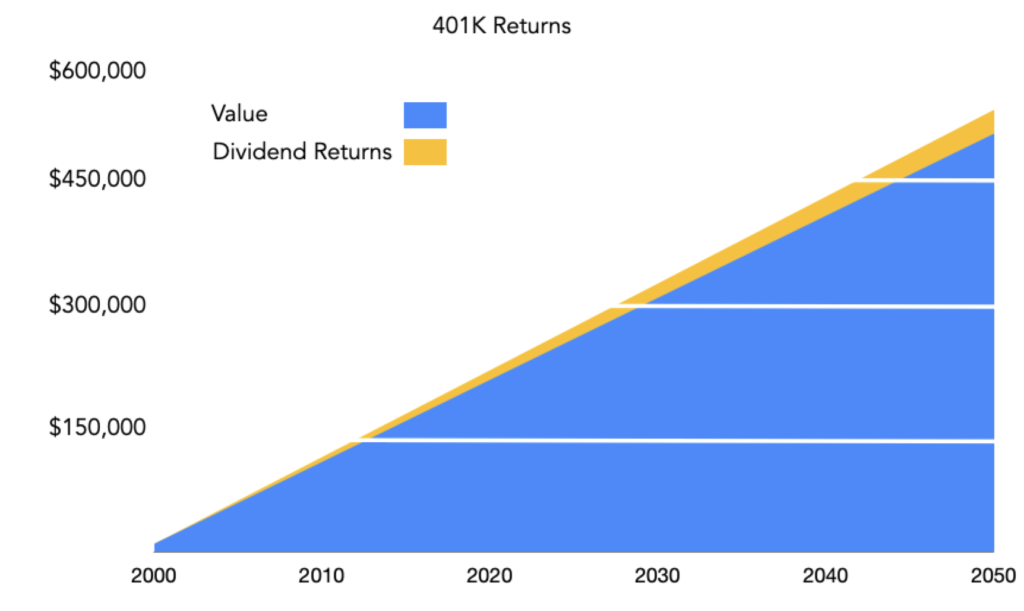
A good analogy is a difference between investments and returns on a 401k account. The chart below shows a hypothetical 401k that received $10,000 every year and grew 5.5% annually. I chose this number to match the historical average rate of housing equity growth from 1950-2015. The difference between the investments and returns may not seem significant at first. After 18 years, however, the 401k generates more cash than the individual $10,000 annual contribution. This is a huge milestone.
If we can see these kinds of returns in only 18 years, imagine the kind of growth that’s possible after a couple of centuries. St. Augustine, Florida, generally considered to be the oldest city in America, was founded in 1565–an outlier in our country. Chicago, Illinois is almost 190 years old, but many American cities are much younger. Chances are good that your city has been around less than a century and may only be just a few decades old.
Despite the relative youth of America’s cities, many already have taxable values well into the billions that are pushing upwards through appreciation and new growth. With billions of dollars at play, it is important that the tools we use to measure values reflect reality as much as possible.
That is why we propose that more budgets should include a breakdown like the ones shown below. These three fictitious cities all had the same total value every year and went through the same recession — yet they tell completely different stories.
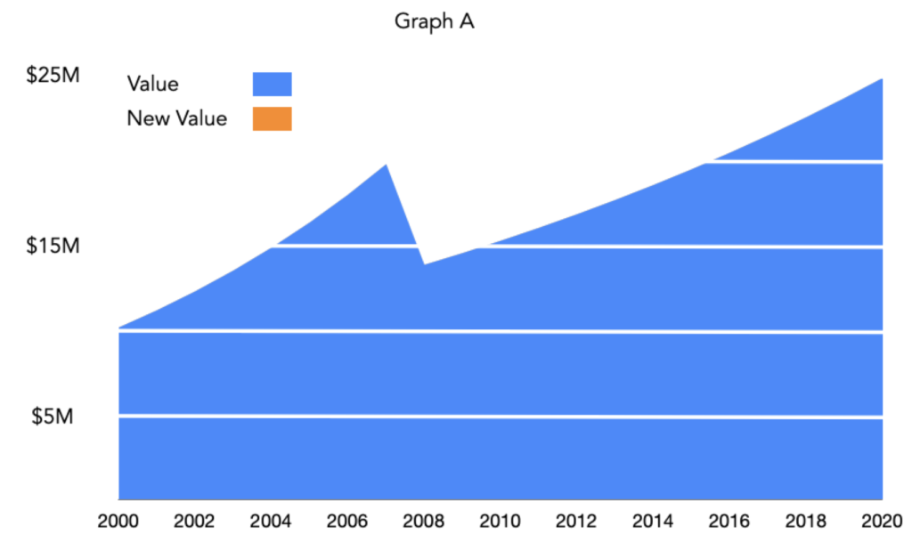
Graph A shows a town that has had no new construction over the past 20 years and lost all of its value in its current properties. This is an extreme example but not too far from the truth in Golden, Colorado where residential growth is limited to 1% annually.
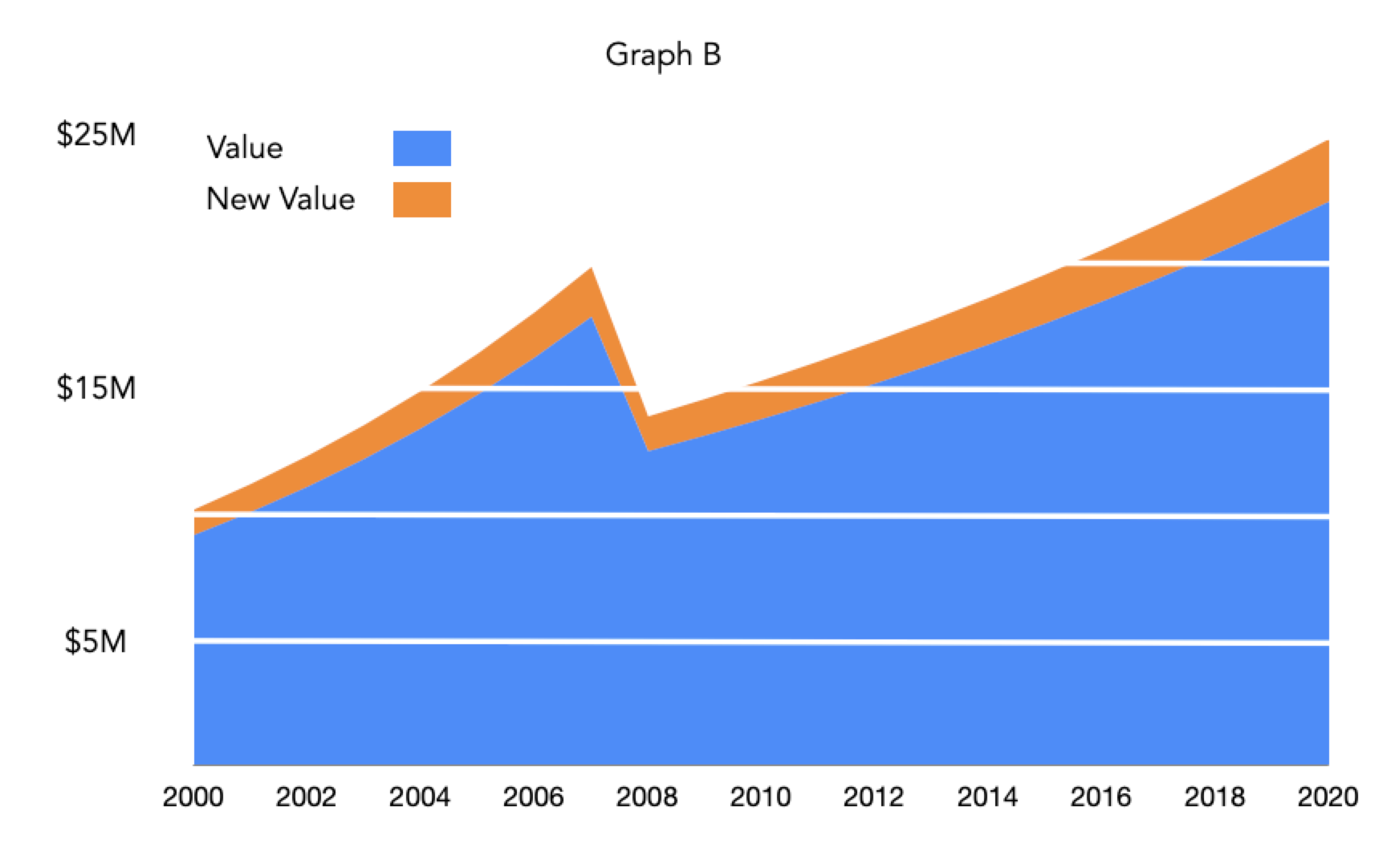
Graph B shows a constant and steady growth of value. There was a dip in both property values and construction during the recession. There is no variation in the % of new value created, meaning the town experienced neither a pre-recession construction boom nor a bust post-recession.
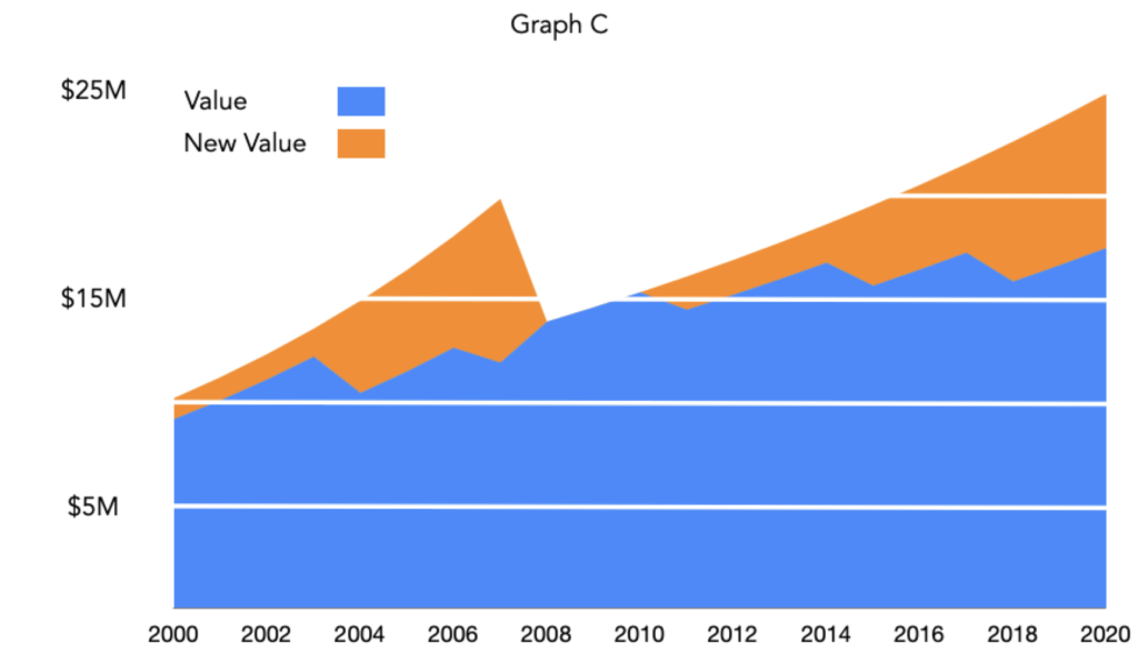
Graph C shows a story you are likely familiar with. New construction was booming before the recession and plummeted during the recession, alongside property value, and both have been on a slow climb ever since.
Unfortunately, these graphs are misleading in another way. None of these have taken into account inflation. As a citizen, if I see property values returning to pre-recession levels, I would think that my community’s economy is healthy. That is not the case. The $25M in your community’s budget will fund fewer planners, police, firefighters, and teachers than it did in 2000. It is a mistake we see often, like the graph of a city recently published below.
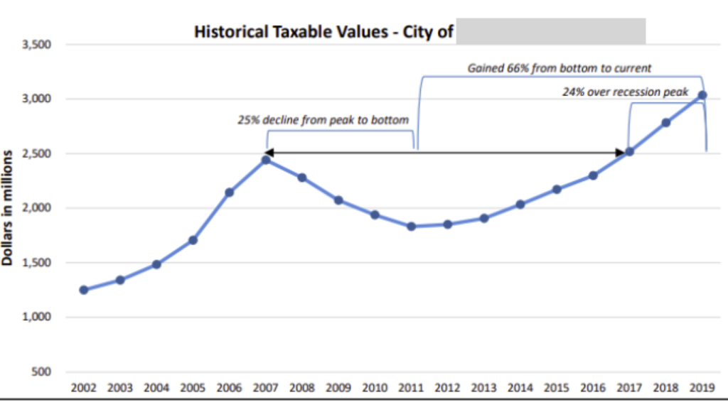
It’s important not to make decisions based on misleading graphs. Without understanding how value is being added, changing, and inflating, over time city officials are missing a key part of the picture. If cities ignore the cost increase and revenue decreases that come from inflation and tax caps like the Save Our Homes amendment they are likely to find their infrastructure costs significantly outweigh their revenue. As inflation increases the cost of infrastructure and tax caps significantly hamper tax growth, cities may find themselves in an expensive situation where even routine maintenance of infrastructure can be prohibitively expensive. Below we have a graphic showing these effects in a recent Urban3 project in Florida.

To better understand that situation at Urban3 we would improve the graph by differentiating between the new and old value and adding inflation information.