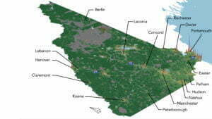
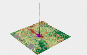
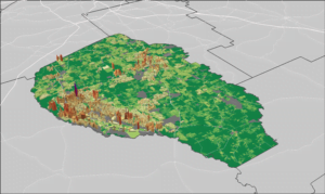
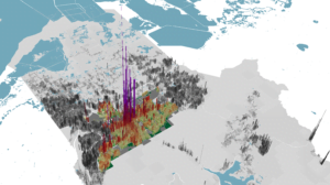
Urban3 was hired by the City of Minneapolis to perform a revenue modeling analysis for all of Hennepin County. Urban3’s work for Minneapolis focused on the property value “per acre” metric, which measures the productivity of different land uses. Hennepin County encompasses a wide range of land uses, from agricultural fields to skyscrapers. As with all Urban3 revenue models, the properties with higher value per acre appeared as purple and red spikes. Less productive properties appeared in green and yellow. We analyzed how City wealth and development are connected through a 3D value per acre model, development over time maps, individual ward reports, and exploratory visualizations of the Minnesota Fiscal Disparities program.

Unique to the Twin Cities region is the effect of the fiscal disparities program. Municipalities within the 7-County Metro Area contribute 40% of commercial and industrial property value growth into a shared pool. That money is then redistributed based on population and the difference between the regional average and each municipality’s average per capita market value of property. Municipalities that are net receivers are green and net contributors are purple.

Minneapolis is also grappling with the long-term impact of redlining maps that were drawn by the Home Owners’ Loan Corporation in 1933. Maps symbolized neighborhoods as “best” in green, “still desirable” in blue, “declining” in yellow, and “hazardous” in red. These classifications were based on housing condition, the racial and ethnic makeup of residents, and other factors. Redlining was a racist practice that denied people of color access to credit, but also boosted property values in majority-white neighborhoods. This exclusion from capital and inequitable protection of wealth had significant and long-lasting consequences for the people and properties affected. Urban3 found that the Minneapolis’ value per acre map corresponds to the 1933 redlining map.

Outcomes
- City Councilors received ward-specific individualized value per acre analysis reports.
- Urban3’s redlining maps gave City staff an additional argument for redressing redlining through a property value standpoint.
- Value per acre maps helped further make the economic case for the elimination of single-family zoning.
- The Minnesota Fiscal Disparities Program was modeled in 3D for the first time, which gave staff a better visual understanding of the program’s economic dynamics.